
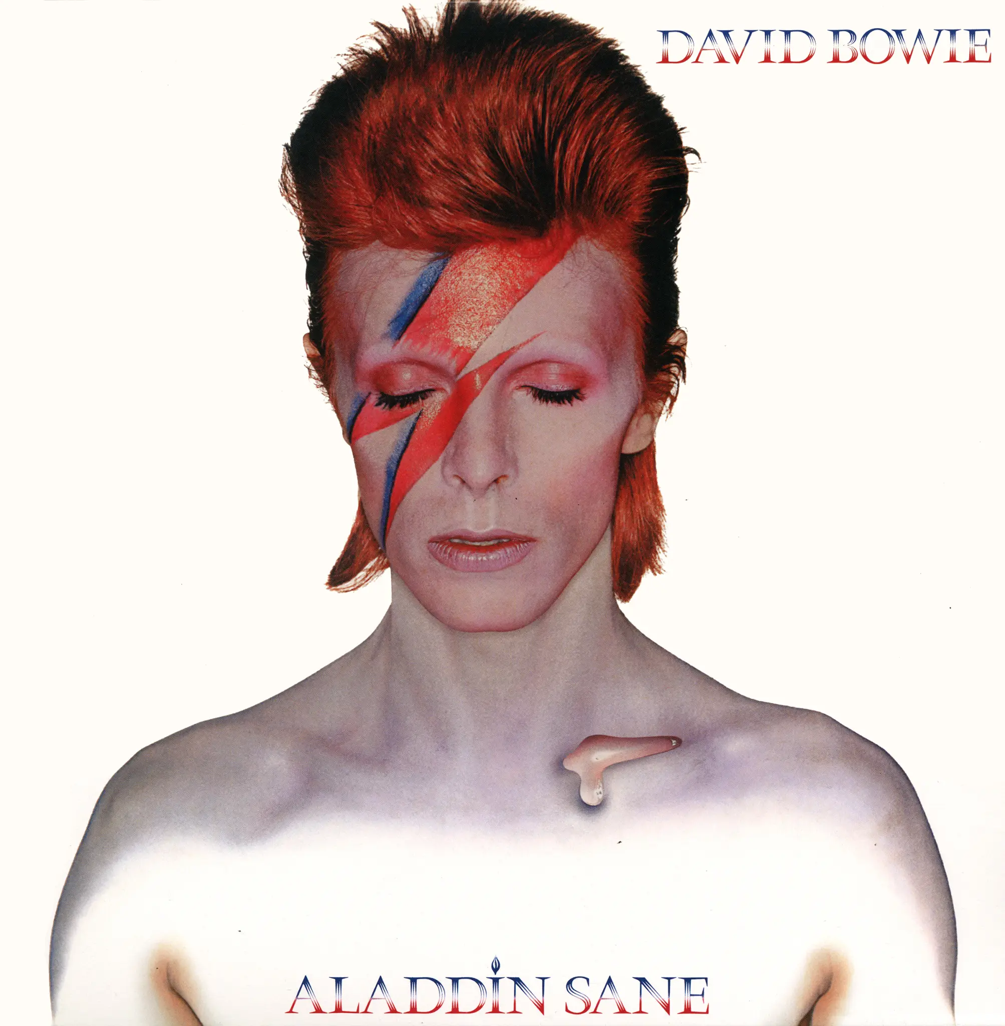
If you search for David Bowie on Spotify, a familiar icon pops up: the man himself, eyes closed, made up with a deathly-looking pallor and a red-and-blue lighting bolt across his face. This is the photo on the front of Bowie’s sixth album, 1973’s Aladdin Sane. “Perhaps more iconic than the music inside,” says the narrator of the Trash Theory video essay above, “it stands as the Mona Lisa of album covers.” It was also, at the time of production, the most costly album cover of all time: this was at the behest of Bowie’s manager Tony Defries, who suspected that sparing no expense on the image would motivate RCA, his label, to spare no expense promoting the album itself.

One might call this a bold move for an artist like Bowie, who had only just made it big. In the early years of his career he’d racked up failure after failure: with 1971’s Hunky Dory, a kind of declaration of commitment to musical and artistic “changes,” he had a succès d’estime, but not until the following year did he become a bona fide star.
The vehicle for that transformation was the album The Rise and Fall of Ziggy Stardust and the Spiders from Mars, which introduced the listening public to its title character, an androgynous rocker from outer space. Throughout his subsequent year and a half of touring Bowie took the stage in full Ziggy glam regalia, inhabiting the character so fully that he eventually began to question his own sanity.
Though young British audiences couldn’t get enough of Ziggy and the Spiders, reactions across the United States were rather less enthusiastic. There, says the Trash Theory narrator, “they were not the type of British rock that rock radio played: hard-hitting, riff-heavy behemoths like Led Zeppelin or the Rolling Stones. But this indifference was shaping what Bowie wanted to do next.” His experience of America inspired a new, harder-edged persona, Aladdin Sane. Ziggy Stardust “was a vision of the best a rock star could be, an inspirational figure, while Aladdin was more about fame’s darker underbelly, filtered through imagined Americana and futuristic nostalgia” — and the character needed a look to match.
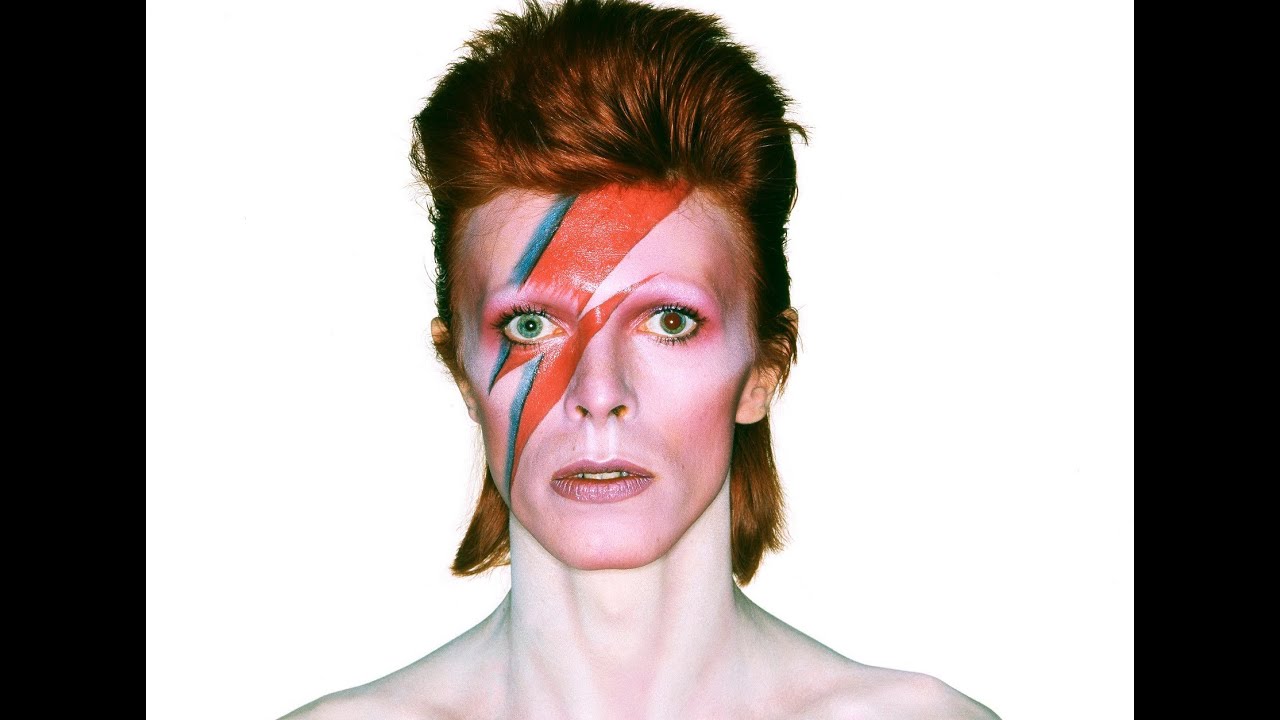
Shot by Brian Duffy, described in the San Francisco Art Exchange vide0 above as “a very eccentric and incredible photographer,” the Aladdin Sane cover was printed with a seven-color system unprecedented in the medium. (Up to that point, four-color had been the standard.) According to Trash Theory, Bowie described makeup artist Pierre Laroche’s lightning bolt “as representative of schizophrenia, and more specifically, his split feelings about his 1972 American tour.” (The shape came from the logo on a National Panasonic rice cooker in Duffy’s studio.) Though the result has become, in the words of curator Victoria Broackes, “probably the most recognizable symbol in rock and roll,” Bowie never actually assumed this look onstage; ahead of him, there still lay four more decades of changes to go through.
Related content:
The Story of Ziggy Stardust: How David Bowie Created the Character that Made Him Famous
David Bowie Paper Dolls Recreate Some of the Style Icon’s Most Famous Looks
50 Years of Changing David Bowie Hair Styles in One Animated GIF
Lego Video Shows How David Bowie Almost Became “Cobbler Bob,” Not “Aladdin Sane”
Based in Seoul, Colin Marshall writes and broadcasts on cities, language, and culture. His projects include the Substack newsletter Books on Cities, the book The Stateless City: a Walk through 21st-Century Los Angeles and the video series The City in Cinema. Follow him on Twitter at @colinmarshall or on Facebook.


0 Commentaires